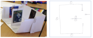
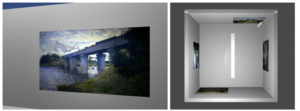
The ‘White Cube Space’ was developed in order to narrow down and categorise concrete means of interaction and have as simple a display background as possible. Taking inspiration from one of the design suggestions in the comparative lab study and considering the comments of the participants, this minimal exhibition space was created. This square-shaped virtual gallery was kept plain white, with an additional wall in the middle of the space. The wall contributed to the gallery without overwhelming the design and enabled a more complex navigation than in a previous application, where almost no navigation was required for viewing the paintings. Being kept simple, all textures and colours were removed from the virtual environment in the ‘White Cube Space’.


